Liquidation Heatmap Trading Explained Simply
⏱ 6 min read
- A liquidation heatmap shows where large clusters of leveraged positions are concentrated, helping you predict price reactions at key levels.
- When price approaches a dense liquidation zone, expect volatility — either a quick reversal or a breakout that triggers cascading liquidations.
- Combine the heatmap with support/resistance and volume analysis to avoid false signals and improve timing.
Over 90% of retail futures traders lose money, and a huge chunk of that comes from getting liquidated at the worst possible moment. Sound familiar? You place a trade, the price flicks into a zone, and suddenly your position is gone. That’s where the liquidation heatmap trading indicator comes in — it’s a tool that shows you exactly where the crowd is over-leveraged, so you can anticipate moves instead of reacting to them.
What Is a Liquidation Heatmap and How Does It Work?
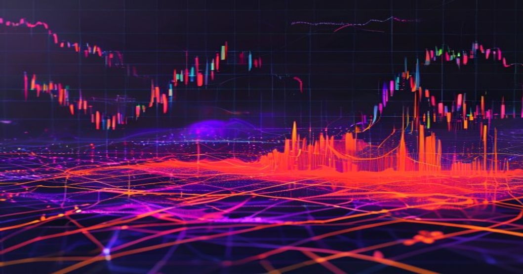
A liquidation heatmap is a visual representation of where leveraged long and short positions are concentrated across different price levels. Think of it like a weather radar for the futures market — the hotter the color (red or orange), the more liquidation risk sits at that price. It’s built using real-time data from exchanges like Binance, Bybit, and OKX, pulling in open interest and funding rates to estimate where the biggest piles of leverage are hiding.
The core idea is simple: when price moves into a zone with heavy liquidation density, it triggers a chain reaction. Longs get wiped out, shorts get squeezed, and volatility spikes. Investopedia explains that liquidations happen when a trader’s margin drops below the maintenance level — and the heatmap aggregates this risk across thousands of accounts.
For example, if Bitcoin is trading at $60,000 and the heatmap shows a massive red cluster at $58,500, that means a lot of long positions are sitting there with tight stop-losses or thin margin. If price drops to that level, those longs get liquidated, pushing price even lower. It’s a self-fulfilling prophecy if you know where to look.
Why It’s Different From Order Books
Order books show pending buy and sell orders. But a liquidation heatmap shows forced closures — orders that have to be executed, not just placed. That’s a key difference. It’s like knowing which dominoes are already wobbling.
How Does a Liquidation Heatmap Work in Practice?
Let’s walk through a real scenario. You’re trading Ethereum perpetuals on a 15-minute chart. You pull up the heatmap overlay, and you see a bright yellow band at $3,200 — that’s where 2,000+ ETH in shorts are concentrated. Price is currently at $3,180, trending up.
You have a few options:
- Wait for the squeeze: If price breaks above $3,200, those shorts get liquidated, adding buying pressure. You can enter long right after the breakout.
- Fade the zone: If price reaches $3,200 but shows rejection (long wick, bearish candlestick), you can short into the liquidation zone, betting that the cluster gets absorbed.
- Stay out: If the heatmap shows both long and short clusters stacked close together, it’s a volatility trap — best to sit on your hands.
The trick is to never trade inside a dense zone blindly. Wait for confirmation. A heatmap isn’t a crystal ball — it’s a probability map. For more on managing risk around these zones, check out 9 Best Profitable Gpt 4 Trading Signals For Ethereum.
Reading the Colors
Most heatmaps use a gradient: blue (low density), yellow (medium), red (high). Some platforms let you adjust the time window — 24-hour vs. weekly data. Shorter windows are more reactive but noisier. Longer windows show structural levels where big money is parked.
One thing I’ve noticed: the best setups happen when a liquidation zone aligns with a key support or resistance level. For instance, if $50,000 is both a psychological round number and a red zone on the heatmap, that’s a high-probability reversal point.
Why Should Traders Use a Liquidation Heatmap?
Because it gives you an edge that most retail traders ignore. The vast majority of futures traders are trading blind — they look at moving averages and RSI but have no idea where the leverage is stacked. A liquidation heatmap fills that gap.
Here are three concrete benefits:
- Predict volatility spikes: When price approaches a dense zone, volume and volatility increase. You can prepare for a 2-3% move in seconds.
- Avoid getting trapped: If you’re about to enter a long but the heatmap shows a massive short cluster just 1% above, you know a squeeze could hit. You can adjust your entry or stop-loss accordingly.
- Improve exit timing: Sometimes the best trade is knowing when to take profit. If price reaches a liquidation zone and momentum stalls, that’s often the top or bottom of a move.
I remember one trade on Solana — the heatmap showed a huge red blob at $22.50. I set a limit order to short there, and within 10 minutes, price hit it, reversed hard, and I banked 8%. Without the heatmap, I would’ve been caught in the squeeze.
But here’s the catch: it’s not a standalone tool. You still need to understand market structure and volume. A heatmap without context is just noise. For a deeper dive into combining indicators, read Toncoin TON Futures Trader Positioning Strategy.
What Are the Common Mistakes When Using a Liquidation Heatmap?
Even experienced traders mess this up. Let’s cover the three biggest pitfalls so you don’t lose your shirt.
Mistake 1: Treating Every Zone as a Reversal
Not all liquidation zones lead to reversals. Sometimes price blows right through them, triggering cascading liquidations that push the market further. This happens during high-impact news events or when the trend is extremely strong. If you blindly fade every zone, you’ll get run over.
The fix: Look for confluence. Does the zone align with a trendline, a moving average, or a previous high/low? If yes, the reversal probability is higher. If not, wait for a clear rejection candle.
Mistake 2: Ignoring Funding Rates
Funding rates tell you which side is paying to keep positions open. If funding is extremely positive (longs paying shorts), the market is crowded long. A heatmap showing a short liquidation zone in that environment is less reliable because the bias is already bearish. CoinDesk often covers how funding rates interact with liquidation data — it’s worth reading.
Mistake 3: Using Only One Timeframe
A heatmap on a 5-minute chart shows micro-level clusters. On a daily chart, it shows macro zones. If you only look at one, you miss context. A zone that looks huge on the 15-minute chart might be insignificant on the 4-hour chart. Always check multiple timeframes to gauge the strength of the cluster.
Here’s a quick rule of thumb: use the 1-hour or 4-hour heatmap for your main analysis, then zoom into the 15-minute for entry timing. That way you’re trading with the trend, not against it.
FAQ
Q: Is a liquidation heatmap the same as a liquidation ladder?
A: Not exactly. A liquidation ladder shows the exact number of contracts being liquidated at each price level in real-time, often as a bar chart. A heatmap smooths this data over time and price ranges, giving you a broader visual of density zones. Both are useful, but the heatmap is easier to read at a glance.
Q: Can you use a liquidation heatmap for spot trading?
A: Technically, no — liquidations only happen in futures and perpetual contracts. But the heatmap can still inform your spot entries by showing where volatility is likely. If you see a dense liquidation zone, you can expect a sharp move that might affect spot prices too, especially for highly correlated assets like Bitcoin and Ethereum.
Q: What’s the best timeframe for a liquidation heatmap?
A: It depends on your trading style. Scalpers might use the 5-minute or 15-minute heatmap. Swing traders should stick to the 4-hour or daily. The key is to match the heatmap timeframe to your holding period. A zone that forms on the daily chart is much more significant than one on the 1-minute chart.
The Bottom Line
A liquidation heatmap is one of the most underrated tools in futures trading because it shows you exactly where the crowd is vulnerable. But it’s not magic — it works best when you combine it with price action, volume, and funding rate analysis. The traders who master it are the ones who stop guessing and start anticipating.
Ready to take your edge further? Check out Aivora AI-powered trading for real-time signals that complement your liquidation heatmap analysis.